Printboss.com 2020
Overview
This is a current, ongoing project, and I am part of the team responsible for merging 3 different product websites into 1 “umbrella” website. Wellspring Software, Inc. has been around since 1998, and their main eCommerce website, www.wellspringsoftware.com has been quite overdue for a redesign and upgrade.
Part of my responsibilities is to work with the Director of Marketing & Research and Senior Software Engineer to test the existing website for UX inconsistencies and friction points, and to recommend design solutions to make website a better user experience for our different customer base.
The challenge for this real-world project is that it’s all in “pieces” and scheduling organic “sprints” to get the revised site up and running, and then will go back through to tweak and improve user design experience.
Phase 1 - User Testing

Assignment (Phase 1):
Provide feedback for ordering different types of digital & physical products through current eCommerce site.
I always start the process with sketching and diagramming so that I can visually see and think through the user flows.
The immediate assignment was to go through the shopping cart experience and provide feedback to development team.
I found a couple of critical inconsistencies with the user flow - which I broke down on each page even further for review. But the main friction points were trying to “Create a New Account” (and how the user goes back to shopping cart, and then a critical friction point of clicking on “Continue Shopping” dumped the user back to the main printboss.com homepage.
My suggestions were to clean up the “Create a New Account” page to adhere to UX best practices and standards and then to redirect “Continue Shopping” button to the “Store” page.
Inconsistencies overall (which I diagramed with a Site Map for Phase 2) was the issues of not using standard eCommerce language/wording to sell products and direct customers intuitively to a “storefront.” I do not like “Order Now” which does not provide enough context for users/customers to understand what it is they are ordering. My recommendation is to update to “Store” or “Buy” but I would follow through with conducting a card sorting exercise to gain more insight into which word to use moving forward.

Phase 1 - mapping current User Flow Shopping Cart and then highlighting friction points and recommendations

Checkout Page
UX design issues with checkout page and inconsistencies
Proposed Redesign
fdsds


Friction Point
Issues are re-examined here in User Flow showing “Continue Shopping” button needs to land the customer back on the “Product Page.” And my recommendation is to build that product page like it’s own store homepage within the entire site (a mini-eCommerce website within the entire marketing/sales website).
The “homepage” of the store should be much more informative (Phase 2) with basic information about the kind of check stock Wellspring sells and why they should purchase it, as well as their envelopes and MICR toners.
Also need more info on digital products like software, service contracts and even custom work. So many emails and phone calls on a daily basis asks the same questions over and over again, this would be a place to answer many of those questions for customers.
Current Login Page
Goal of the current login page is to consolidate and simplify since Wellspring currently has (3) different product websites, the current Login page is challenge for customers.
However, my role was to add UX/UI to this page since the dev team just “slapped” buttons here and there without much thought to what it looks like on screen.
My thinking behind my recommendations for a new, overly-simplified login page stemmed from design standards typically applied to mobile apps. Overall, we are all used to apps and mobile devices and they are required to offer as simple design with high functionality as possible since there’s not much space on mobile screens.


Revised Login Page
My recommendation of the redesign of the Login Account page is to follow mobile/app best design practices.
Login should be for returning customers.
Any new customers, recommend putting a link underneath the “Login” button. Even though this is important to capture new customers, ideally they only sign up once, and therefore, most of the traffic is returning customers.
One login means the back-end of the website is required to recognize the user either as a “normal” customer, a Partner, or a PrintBoss Online user. All three require different set of account page, different pricing structure and different products.
UI Design recommendations is to layout key design elements from “left-to-right.” Enlarge the “Login” button and position and get rid of the “Create an Account” button from previous example.

Create an Account Page
Immediate updates to this page is critical. Honestly this page was a bit of a mess.
Simplify and clean up with again the idea of positioning design elements from “left-to-right” so as the user “reads” the information and fills out the form fields, it flows better.
The error messages needed to be placed to the right of the form fields (UX best practices) instead of upper left corner. Highly recommended to tell user what kind of password is needed (instructions of 10 characters, 1 capital letter, 1 number etc).
Better “user-friendly” text for error messages instead of “The reCaptcha Response fields is required” it should say “please check box since you are a human,” instead of “Are you a robot? Prove it.”
Required fields should be upper right out of the way.
"Submit” button should be much larger.
Asked boss if we need “Sign Up for newsletter” and he said yes. So offering recommendation to add additional wording like “We only send out newsletters once a month and would never share your information” or something to that effect to build trust.
Checkout Screens
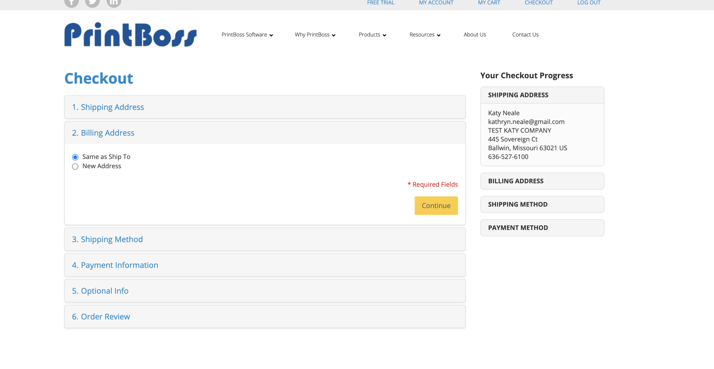
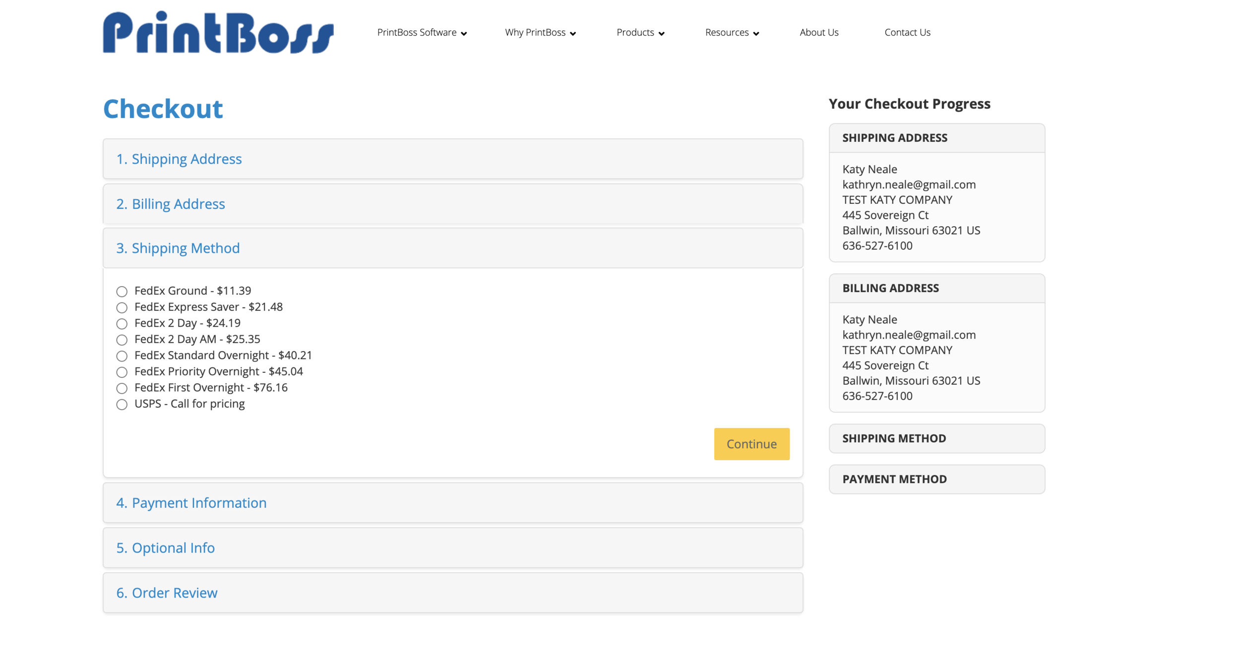
Proposed to Remove Billing Address step:
Billing & Shipping Screens became an interesting issue where my colleague & I asked the dev team to remove billing address completely and only use the credit card billing as a “billing address” so that the user flow is more consistent with all other major eCommerce sites (where no billing address is used, just asks for shipping address and then credit card billing address). Both Director of Marketing/Research and our head Software Engineer said with tax law this is not compliant. So we are still in discussion of whether we can allow the user to “skip” this step but for now, it has to stay until a resolution is researched and agreed upon.Add Notes to Shipping for Explanation:
This one is a bit tricky but because I work directly with customers on a daily basis with placing orders, about 90-95% of our orders we can ship our preferred method of FedEx Ground with no glitches. But we updated our shipping method ship FedEx International Economy for all Canadian orders because it includes brokerage and taxes within the total price, it’s 2 day express, our margin is higher and the customer is happier because they actually pay less than Ground. The total price for International Economy always needs to be lower than FedEx Ground to Canada. We also ship to USPS and have fixed pricing depending on quantity of check stock but if it’s not check stock then we need to quote it for them. And finally, there is no way for us through FedEx Ship Manager to delete the “FedEx Express Saver” option. It’s so confusing for customers but that only is efficient and cheaper for coast to coast shipping. We are located in St. Louis, so Express Saver option is always hugely expensive option and is more like 3 day shipping when most Ground is 2 days.
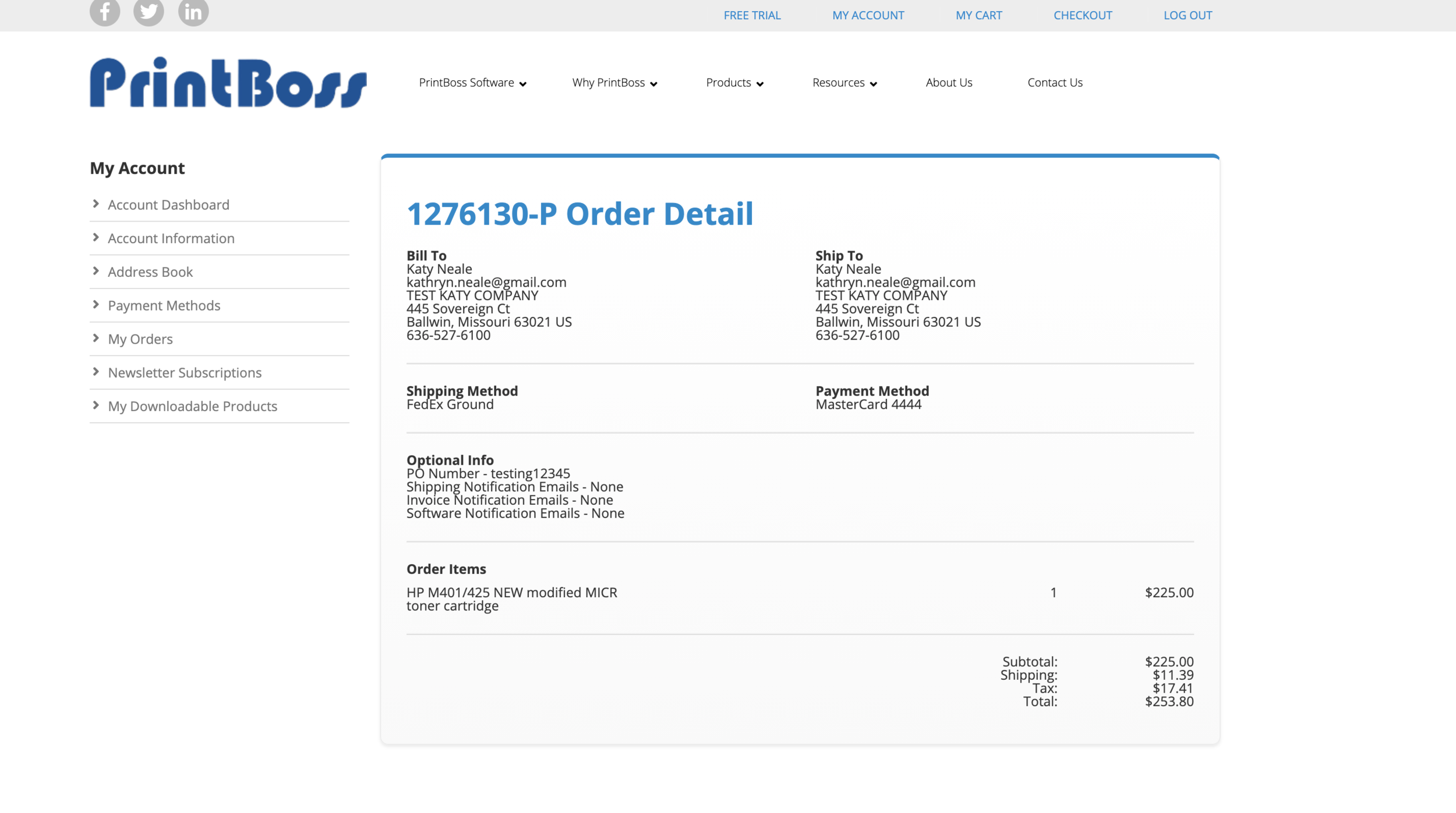
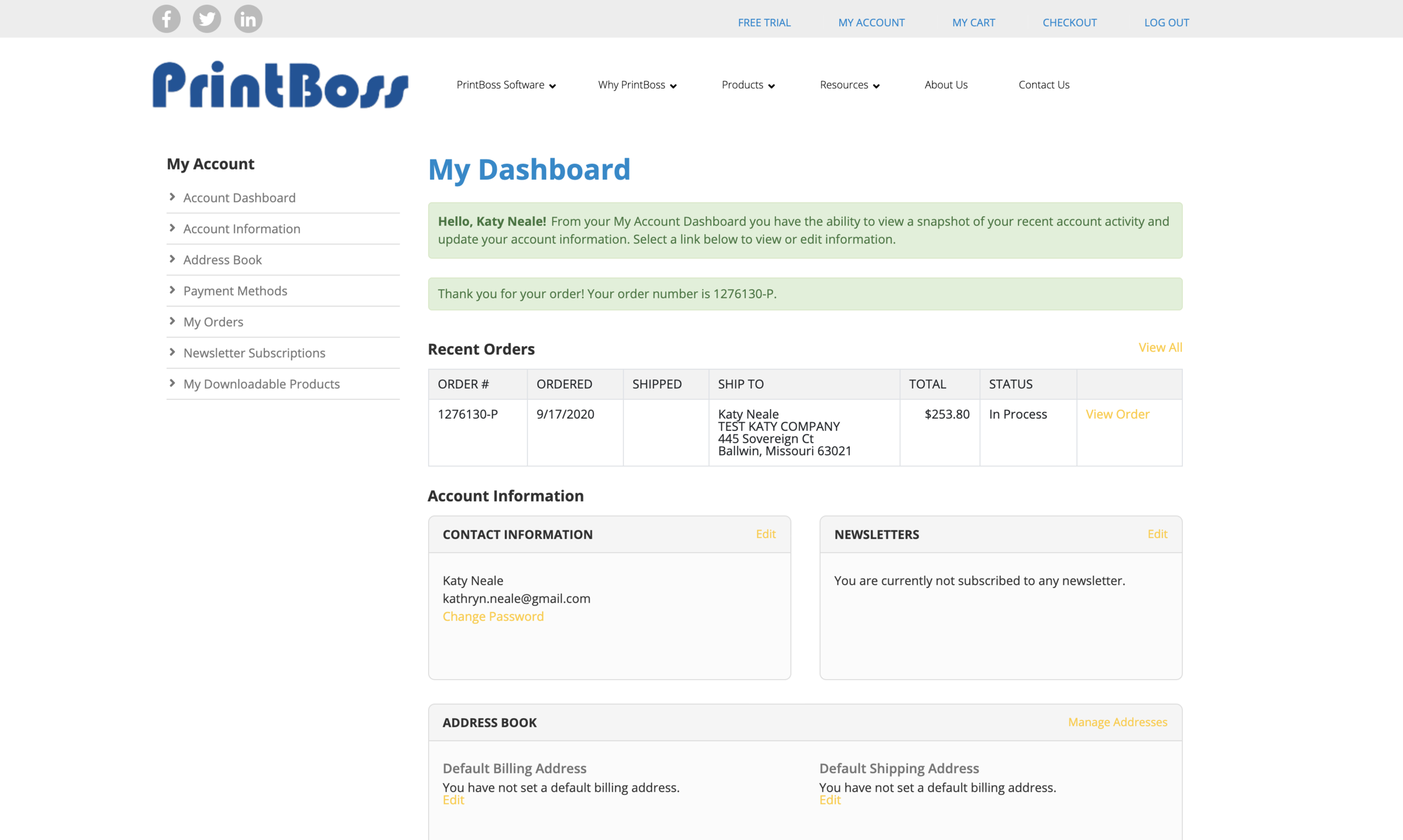
Both Order Confirmation Screen & “My Account” Page needs Text Formatting
These screens are quite obvious but text runs together and kerning and spacing are crowded together making text very difficult to read.
Phase 2 - Site Map & User Flow

Current site map for www.printboss.com
First, I went through existing website to map out current Site Map.
Proposed Revised Site Map:
My recommendations immediately was also consolidate and simplify the site map.
For Phase 2 (or 3) I would love to do more testing on the user on-boarding experience. There is zero help from Wellspring and PrintBoss’ current website, and in today’s world, it is a challenge for user to know where to go or what they are looking at. The main part of the website is “sales,” selling what PrintBoss is (which is a check printing software that is an add-on to accounting softwares) and then why customer might still want to print checks in a digital world. A more comprehensive on-boarding experience (that would mimic mobile apps) would be ideal to funnel customers to the right product and meet their needs and expectations quicker. (However, this would need more user testing and collaboration with stakeholders).
Consolidate “Support” into “Help” section - which would include not just technical support (which is what it does now) but also Order processing help, custom help and basic FAQ’s that can. be answered.
The largest recommendation I offered was again, to update the “Products” to “Buy” or “Store” button to indicate a eCommerce experience. The “store” is the major upgrade for Phase 1. Currently, www.printboss.com only sells the PrintBoss software. Our www.wellspringsoftware.com website sells all of our products. This Phase 1 is launching a complete online store and therefore, my proposal is to update that button so help users/customers locate the Store quicker.
Also re-arrange from left-to-right the main customer experience - from the Left start with learning about PrintBoss/Free Trial. Then move into purchasing software, look through the marketing/selling point of PrintBoss itself (the “Why PB” section), get any HELP to your questions, learn about us and then Store is the main far right area of the website (almost a sub-website in the website itself).
There should be at least 2 places for users to purchase the software. (In current website only 1 user flow through the “PrintBoss Software/Pricing” pages can someone purchase PrintBoss. So adding another “software” tab under drop-down menu under “Buy” is necessary.

Proposed Site Map
Proposed User Flows